
Tools
Figma
Sketch
Timeline
08/2022 — 09/2022
My Role
UX Research
UI Design
Shopify Plus Redesign
This project aims to address the barriers to personal experience in Shopify's web pages and redesign the home page to improve the efficiency of the company's employees in finding data relevant to their tasks -- through Background Research, User Research, setting up the prototype, and conducting follow-up Usability testing to solve problems and improve existing design shortcomings. This is an individual project completed in 1 month.
Design Preview
Redesign the homepage and design new features to support the user’s needs

Redesign the searching function

Overview
Initial Thoughts + Motives
When I first used this website, I was assigned to study how to design new features to help improve the page views of the introduction interface of some unwanted products. That meant I needed to find data on which items were selling best in Shopify Plus. However, in using it, I needed to constantly switch interfaces from task to Shopify to ensure that the data I was looking for was correct. It is also difficult to find general information efficiently on the homepage.
What Shopify Plus can do
Shopify Plus is designed for businesses that need a powerful and customizable e-commerce platform that can handle high volumes of traffic and sales, and provide advanced features for managing inventory, tracking customer data, and creating custom integrations.
Background Research
To define the target users of this platform and clarify the challenge
By conducting background research, I found out that over 5,300 businesses are using Shopify Plus, retail, fashion, and apparel dominate the use of platforms and Shopify Plus is only available to merchants with revenues between $1 million and $500 million.
The dominant industries are all involved with eCommerce and online business.
Shopify is the top 3 platforms used in the eCommerce market
Increasing sales should be the number one objective for the eCommerce business.


Takeaways
Target Users
Merchants who focus more on their eCommerce and online businesses.
Users’ goal in using this platform
Because the order quantity is huge, Shopify plus is needed to provide them with more convenient and fast service to help them increase sales.

User Research
To identify user pain points to uncover the existing problems and Understand what people were frustrated with using the Shopify Plus
Think-Aloud and Interview
Participants: 10 persons who mostly work in the e-commerce industry
Research method: Think-aloud
Goal: Use an open-ended task to explore what people felt and were frustrated while using this platform.
Open-ended task: “Find the data related to customer needs as soon as possible ”.
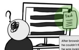
During the process, I observed their actions and created a user flow to depict their common behavior. It helps me to better understand why the existing features didn't work. I also marked on the user flow with a green circle all the confused actions they felt while using the platform.

I also interviewed them to further understand what they thought while using it and found out:
8 / 10
use the platform every workday
7 / 10
Couldn’t remember the task while searching
5 / 10
want to see it find the info directly on the homepage
Design feature for the website
Analyze the customer info
Discover the sales and order info in different time periods
Find some supporting info for their presentation
Complete the task
What do you usually use this platform for?
Key Painpoints
Users feel hard to remember the content of the task during long-time searching.
Users feel frustrated to switch different screens back and forth multiple times.
Users need a more convenient way to search for the correct info and utilize it.

Persona
Further identify the target user from a broad user group and identify their expectations to extract design solutions
I decided to create a persona with a background story to better understand and visualize how to build a solution that satisfies the needs and solves the problems of the specific user group

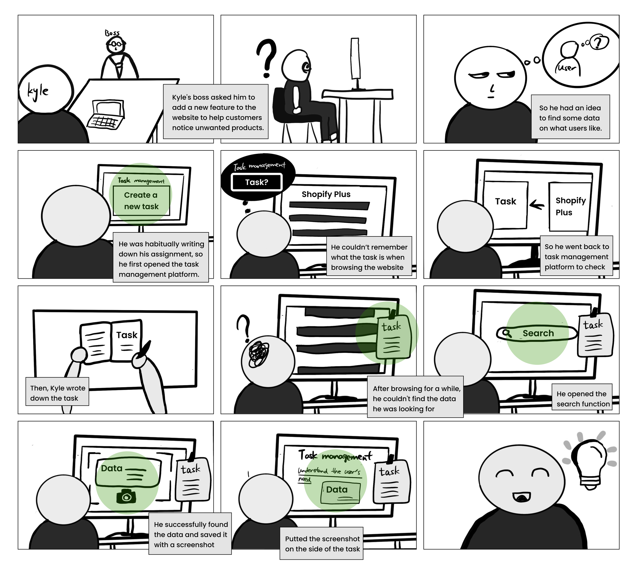
Storyboard
To better understand how a potential solution could help Kyle(our target audience) with his problem and provide convenience to his life.
I created a storyboard to depict the daily task that Kyle would face while using the platform.
Then, I circled the possible opportunities.
Solutions
Design Solutions
The solution should clarify to the user what information is relevant to the task.
Click a specific task and show the related info automatically
Users feel hard to remember the content of the task during long-time searching.

Help users to find the data and check the task simultaneously.
Integrate the task management function into the website
Users feel frustrated to switch different screens back and forth multiple times.

Combining the insights from the different research sources as well as from the persona, it became clear that the platform had to focus on excelling in the following aspects.
I decided to add some auxiliary functions based on the original design and focus on improving the user experience of the homepage so that I can know if the design iterations meet users' expectations through subsequent usability testing.
Minimize unnecessary user operations (such as manual typing search).
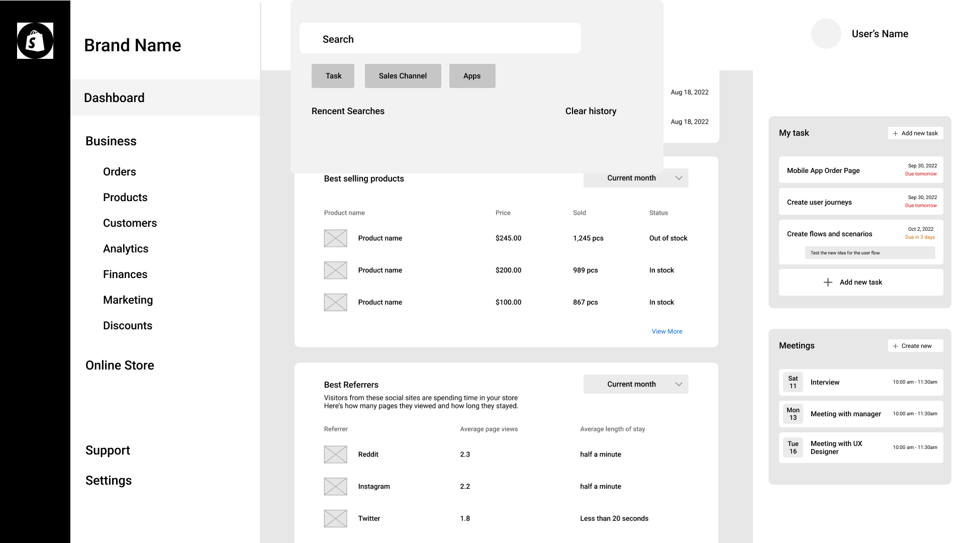
Show the list of tasks after users open the search function
Users need a convenient way to search for the correct info and utilize it.
Be more straightforward and recapitulative to show the information.
Reorganized the homepage layout
Users need a convenient way to search for the correct info and utilize it.
Prototyping
With insights and user needs I defined before, I created a rough prototype to test out how the target audiences feel, find flaws in the logic/flow and generate feedback from others.


It is less efficient to add more description to emphasize the needed information
Extract keywords from each task and users can click the keywords to find data more conveniently
There is no clear button for users to combine data with the task
Add the “add” button by the side of the correct info
It improves the efficiency of viewing data and tasks simultaneously
The grid system shows the information much more clearer.
User Testing Insights
Final Design
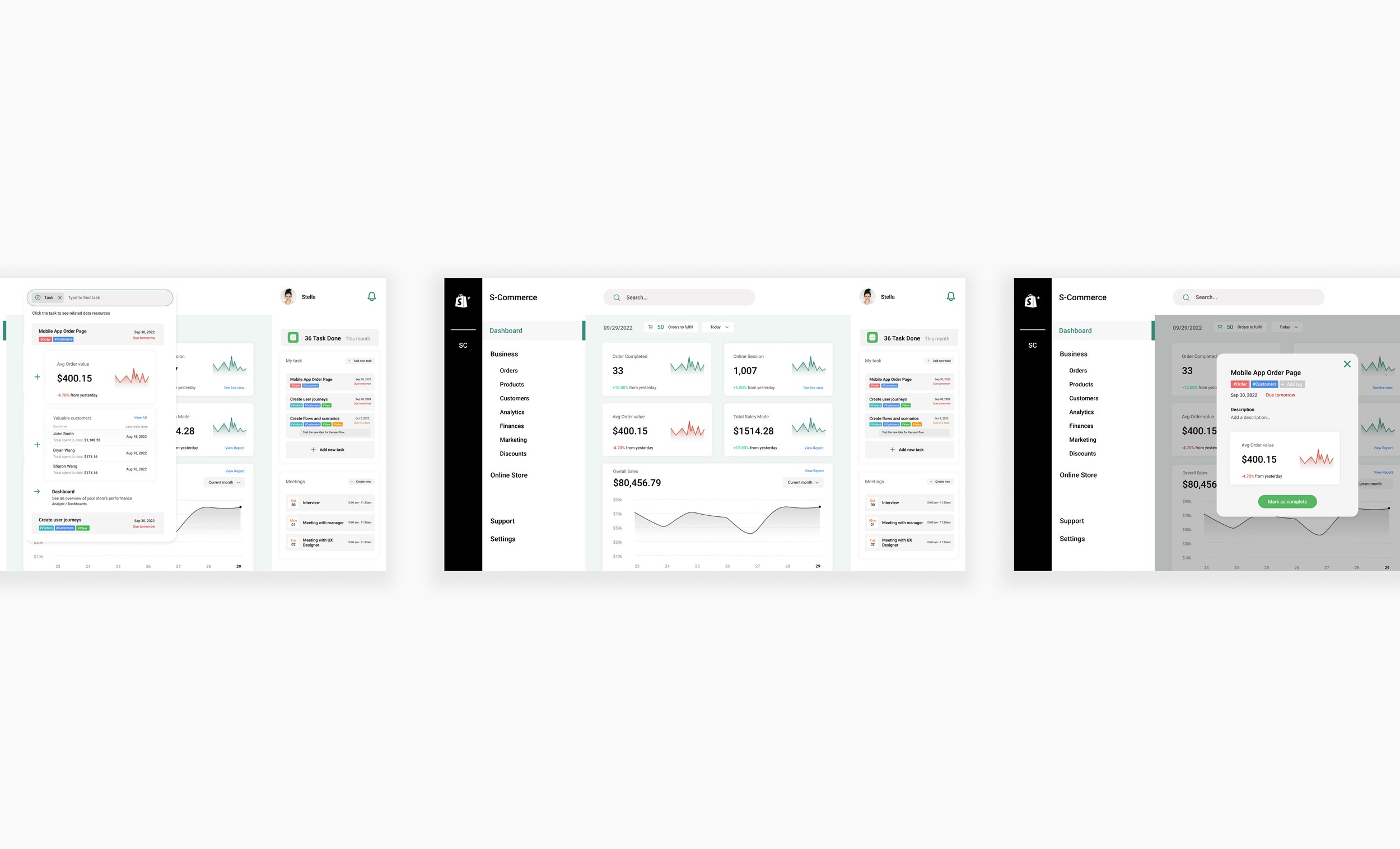
01 Homepage reorganization
Add task management on the side
The task management function helps users to manage tasks and meeting schedules. Adding it on the side of the data's display can assist users in finding information more efficiently.
Related Design Goal:
Help users to find the data and check the task simultaneously.

Reorganize the structure of the homepage
Related Design Goal:
More straightforward and recapitulative to show the information.
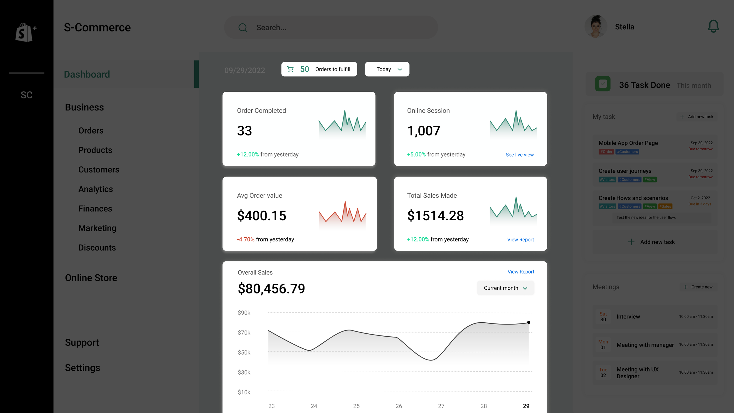
02 Search Feature
Searching Function
I added a new " task " tag to the original search by tag and type. This allows users to search for relevant information by clicking on different tasks.
Related Design Goal:
The search function should minimize unnecessary user operations (such as manual typing search).

Searching Function
After users click the “Task” tag, they can see a list of the tasks.
Related Design Goal:
The search function should minimize unnecessary user operations (such as manual typing search).
Help users to find the data and check the task simultaneously.

Searching Function
By clicking the specific task, users can see the related information that the website automatically matches for this task.
Related Design Goal:
Clarify to the user what information is relevant to the task.
Help users to find the data and check the task simultaneously.

03 Task Management
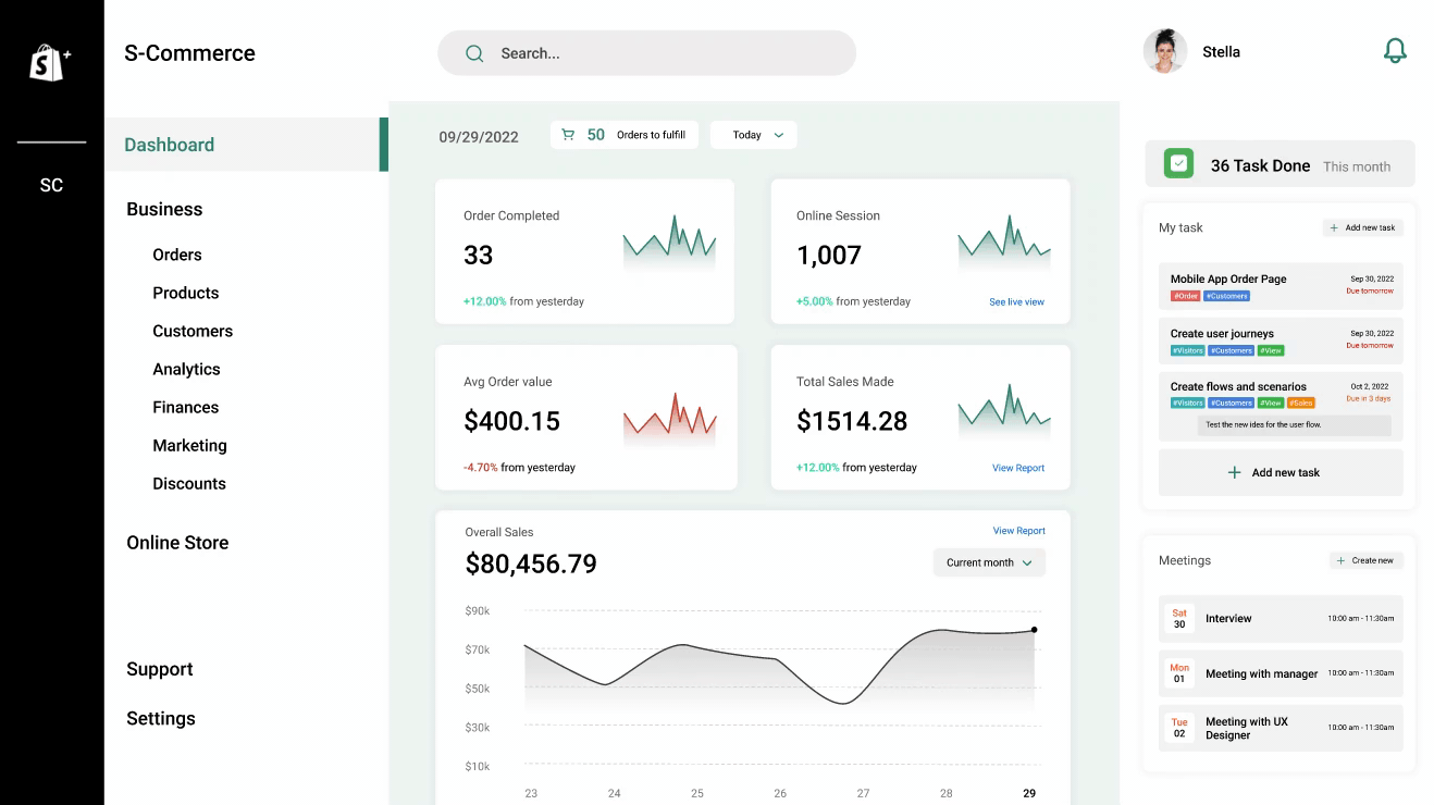
Editing the task
Related Design Goal:
Clarify to the user what information is relevant to the task.
Help users to find the data and check the task simultaneously.

The key takeaways from this project include the importance of conducting background research and analyzing data to fully understand the problems at hand. Additionally, the project highlighted the need to consider the user experience and make data easily accessible to improve the efficiency of the company's employees.
If given more time, developing a mobile version of the redesigned home page would be a valuable next step, as it would allow designers, market managers, and project managers to access and review the information at any time and from any location. This would further improve the accessibility and usefulness of the redesign and make it more convenient for employees to use in their daily work.
Lesson Learned
NEXT PROJECT
NEXT PROJECT

A game named ‘Shapetopia’ that emphasizes the broader conception of sustainability for the university community.